Inline: Out of Time
Results
Wireframed, prototyped, and designed a main menu, level select, and gameplay HUD that provided a quick, easy-to-use experience while providing the game’s signature “style”.
Available on Steam
Role
UX/UI Designer
Level Designer
Dev. Period
Begin: Sept 2022
End: August 2023
Tools
Axure RP
Team Size
12 people
Overview
In this project early in my design career, I wireframed menus and HUD for INLINE: Out of Time. I worked closely with artists and programmers to achieve the style we wanted in a very limiting environment.
Project Results
The game’s UI and UX achieved…
Accessibility to many kids and adults
An easy-to-use, straight-forward design
Ability to get into the action quickly
To compliment artist’s vision
Brief Background
I was on-boarded to the project specifically for my UI wireframing abilities. I worked closely with the artists on the team to achieve designs that would match the game's artistic vision while also being clear and clear for the user.
Since I was the only designer on the team doing UI, I also had to work to layout the UI for things like the HUD and Score Screen which I will include here as well.
Planning
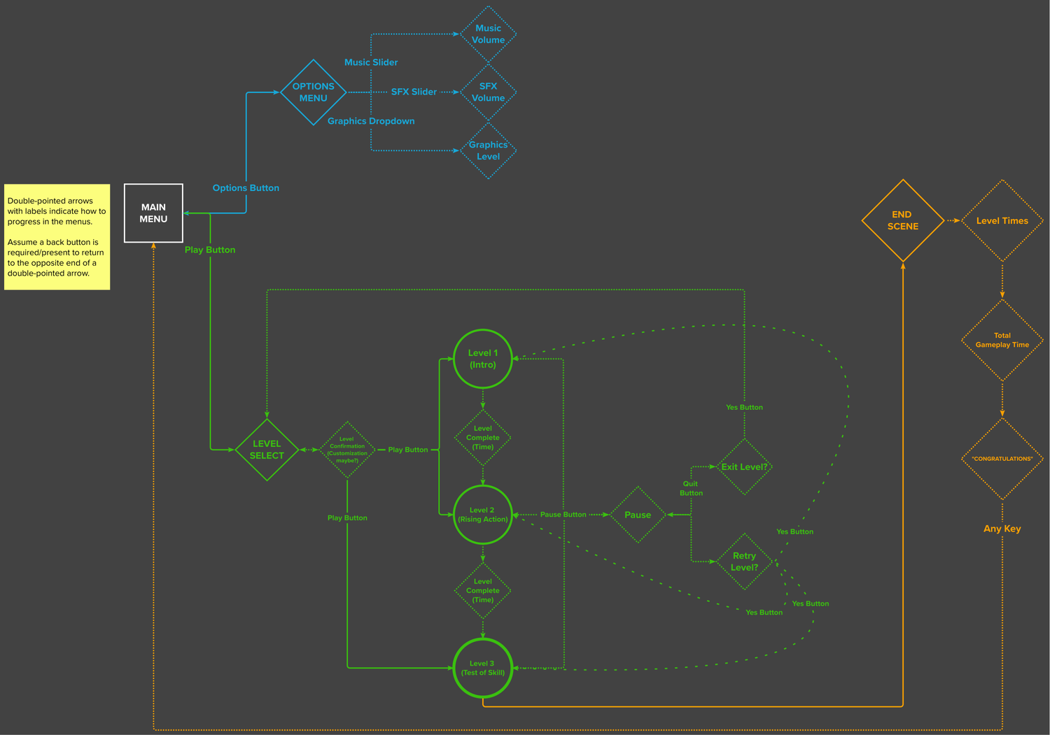
My first step was to create a flowchart for the UI to give a visual map of the menus.
This also helped me visually verify how many menus exactly were necessary for the minimum viable product.
Usually, at this point, I’d want to create a mood board of the vibe I want the menus to have. Luckily though the artists of the team had created art for the game already and had decided a big inspiration for the game to be a grungy, punk vibe similar to games like Jet Set Radio. So I had plenty of vision for the UI already.


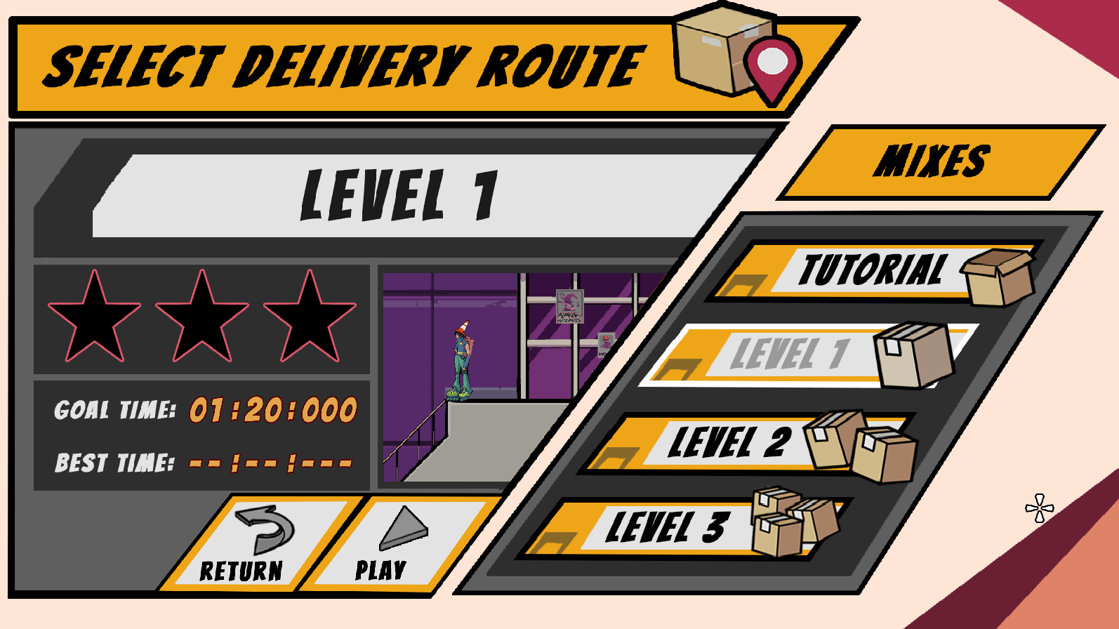
Wireframe and Level Select
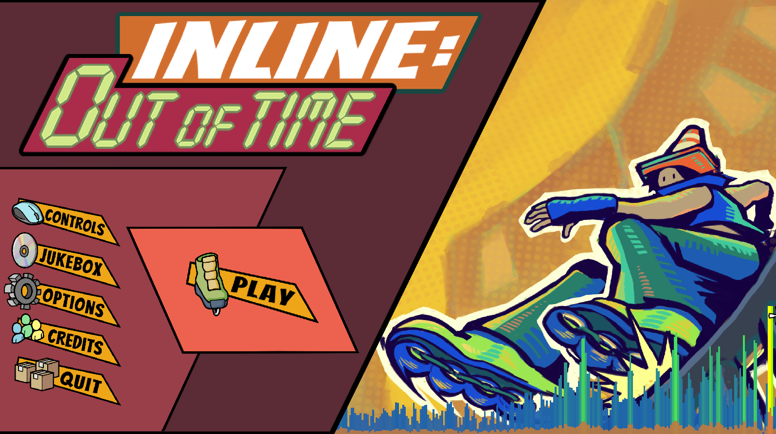
I went on to create a wireframe for the game’s menus starting with the main menu. I tried to have the important buttons stand out so they’re almost immediately identifiable to use.
The layout and style were done in cooperation with the artists.
I made the basic layout mock-up to see how the level select felt contextualized as if each level were cassettes which was brilliant.
HUD
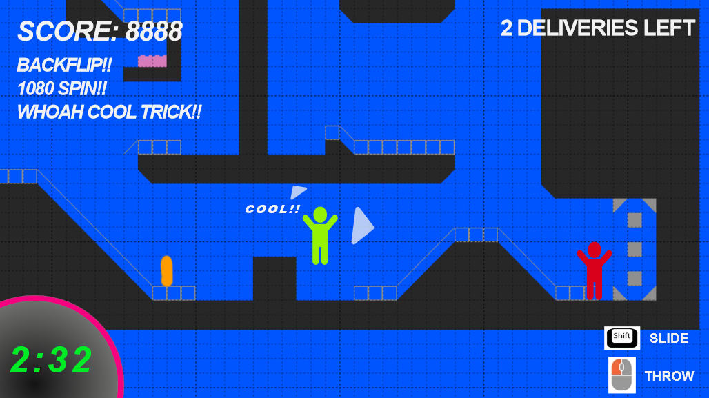
It was my job to first create a prototype HUD for the gameplay.
Originally, many elements were on screen. Including score, trick history, deliveries left, time, and controls.
Quickly, I realized this was too cluttered for the gameplay of the game.
Additionally, the elements being off in the corners made information too spread apart.


HUD Iterations
After many iterations, I deduced that the element necessary for such a simple game was an elapsed timer—keep it simple.
The scoring element was cut early in development for scoping reasons.
Another element I developed for the HUD was an arrow to point to the deliveries in the area. I was hands-on with the development of the arrows to get it how I wanted.
The arrow would grow and shrink based on distance from the delivery so the player may judge their distance. But I wanted to be sure they never became too big to obstruct gameplay or too small to be useful.

Score Screen
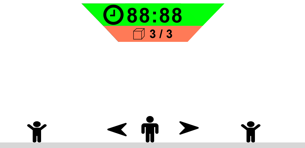
The Score Screen took a bit of work and reworks to get to a point we liked but in the end. The first official version of the score screen displayed the Shift Time (completion time) and Par Time (goal time to beat) in a slanted box menu with “SCORE” at the top.
At the bottom of the menu, there was another slanted box containing three (3) stars to give the player a ranking based on the difference between the goal time and the completion time (three stars is the goal time).
Quit, Restart, and Continue buttons were intentionally made in different colors for clarity.


Score Screen Iterations
After user feedback / playtesting, numerous problems had emerged…
Best time wasn’t displayed until level select
Time to achieve more stars was ambiguous
Sharing your best times with friends via screenshots didn’t make it clear what level it was for
The last one was a problem me and the team found as well playing our game with each other over Discord!

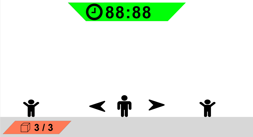
Score Screen Final Layout
The new version replaced the “SCORE” element with the level name. This made it abundantly clear what level it’s for.
“Best Time” was added so there can be another layer of competitiveness and progress within a level.
A feature of the best time element is that if the completion time is below the previous best time, the values for both times appear as yellow instead of white to show “Hey! You did it! See?”

Score Screen Celebration
If the player achieves a three-star ranking, confetti rains from the top of the screen with the stars flashing to show your own flashiness!
If the player didn’t get three stars, I included an element right below the stars that read “Finish below [time] for next [star]”. Eliminating any ambiguous goal to achieve the next best ranking and give players who can’t reach three stars a shorter goal to get to!

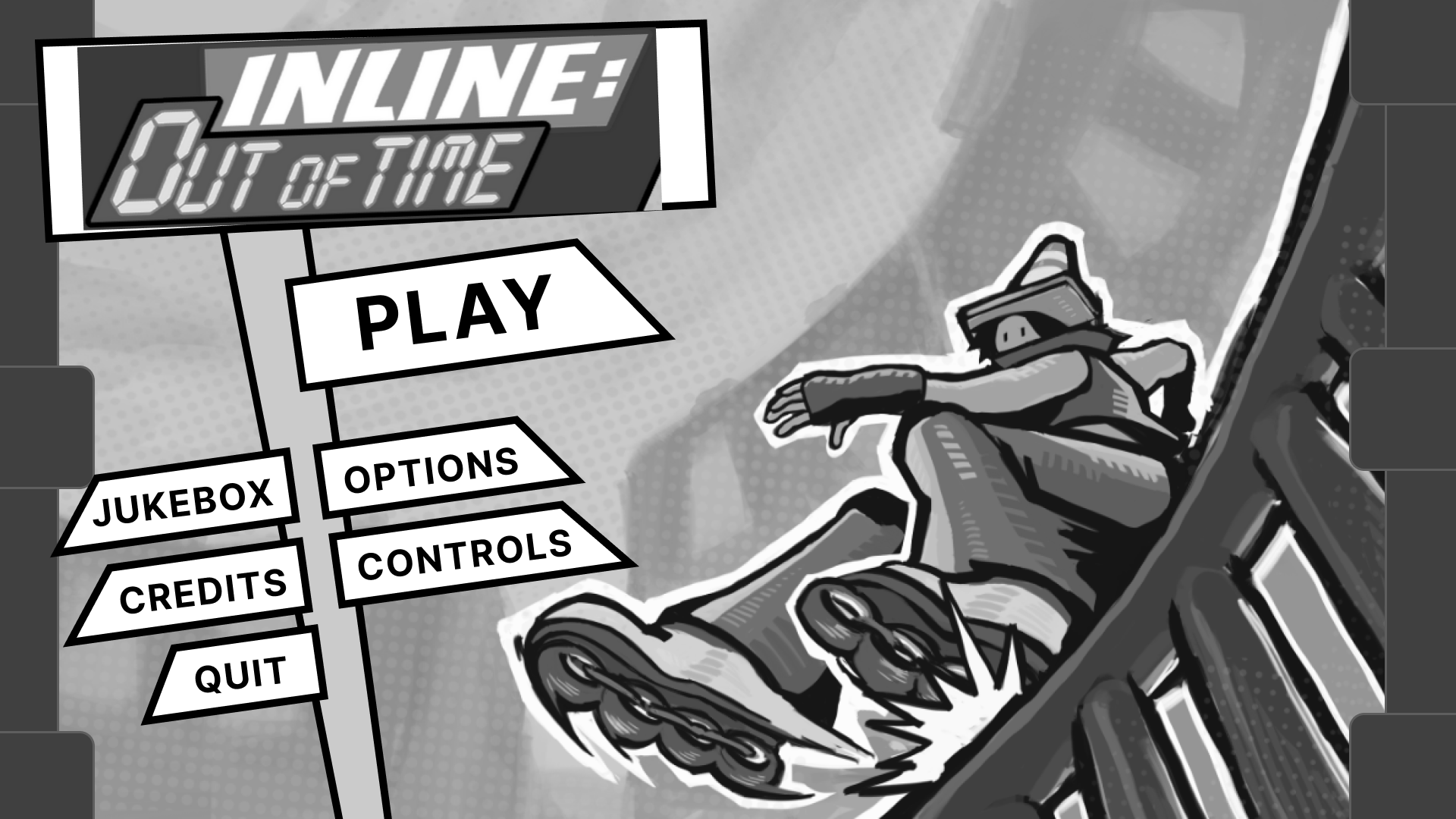
Redesigning 3 Years Later
After years of the game being out, the more the UI work I did looked outdated. So here’s what I did
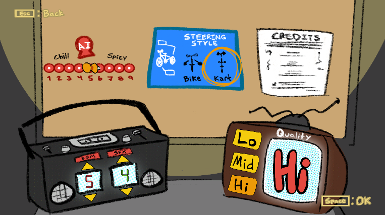
HUD
Made the visual language more in-line with the rest of the UI.
Re-positioned HUD to a corner that is less likely to get in the way.
Included a rank element to give feedback on how well the player is doing instead of waiting until the level is over.
Main Menu
Removed the intrusive background on the UI allowing the artwork to be shown more.
Made the UI feel more diagetic being represented by street signage
Project Reception
Overall the reception to my work in this project added a lot of character and flair to the game’s musical and bombastic feel. Better yet, it seemed to be unobtrusive to the player’s usability of the menus as they never seemed confused.