DNA: Do Not Approach
Results
Improved game feel and user experience by implementing 6 menus, 5 HUD elements, and motion to a game directly in-engine.
Team Size
5 people
Tools
Figma
Godot Engine
Development Period
Begin: August 2024
End: March 2025

Overview
For this project, I got to hop into the Godot game engine (practically) blind and hit the ground running implementing the game’s main menu, options, and HUD!
I even got to learn how to use the animation feature of the engine and how to use “tweens” to achieve motion in the menus and improve the game feel of the game’s UI.
While the project was minimal in requirements, I took this as an opportunity to add the thematic “juice” the game needed to make the game have its own feel.
Project Goals
From the outset, the goals for the project were straightforward enough:
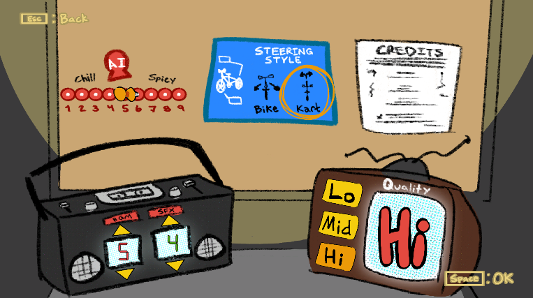
Design and implement a usable main menu for the game.
Design and implement a usable options menu and sub-menus for the game.
Audio Options Menu
Input Options Menu
Graphics Options Menu
Game “General” Options Menu
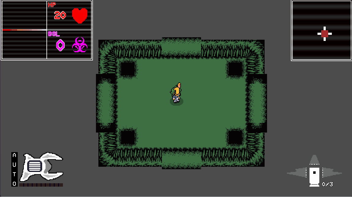
Design and implement a HUD for in-game gameplay.
So yeah, the requirements were very… utilitarian. But from here, I was able to take what I knew about the project and make a user interface that matched the theme I was told to make a unique and fun experience.


UI Direction
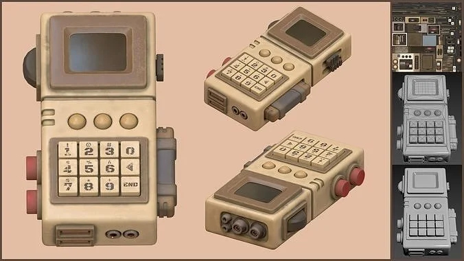
What you can see to the right is the mood board I had created when the project started.
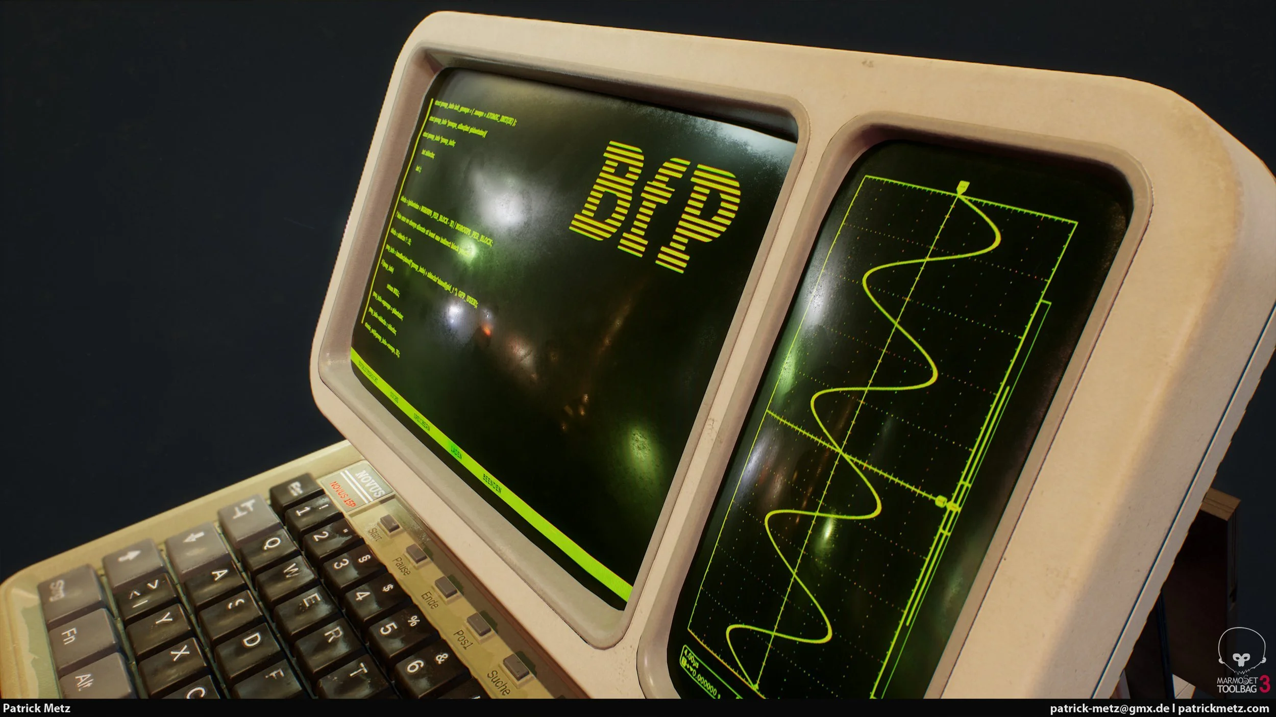
With the slightly eerie theme of the game and being stuck on an alien planet, I thought I’d try going for a mix the “cassette futurism” approach.
I took instances from other games I thought I could pull from, examples of cassette futurist tech and aesthetic, and some contemporary futurist examples I might want to draw from as well.

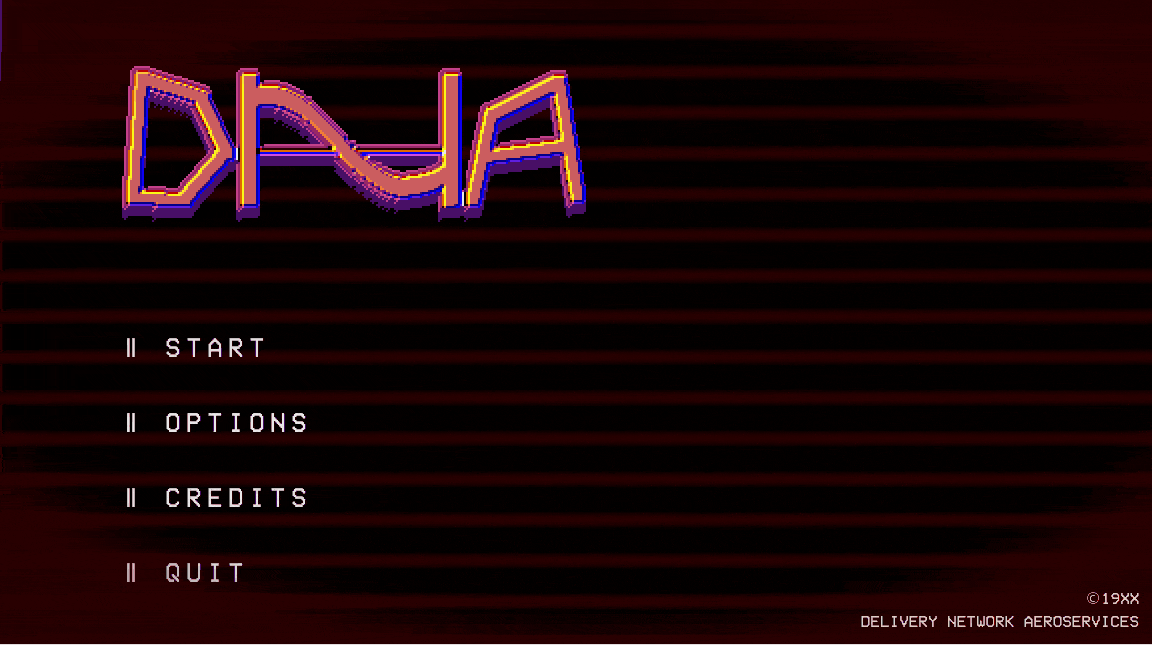
Main Menu Planning
I wanted the main menu to be…
Simple
Understandable
True to cassette futurist / retro tech inspiration
Implementing the “Juice”
That last point is where my bread and butter for this project overall was. I wanted to make sure the idea of “retro tech” contributed to the UI’s feel. I tried multiple methods to achieve this…
Screen scan-lines
Tube screen vignetting
Invokes the sense of watching a diegetic monitor like a security camera monitor
Used a readable but pixel-like font
Created a startup animation
Loading screen emulating old-school computer loading bars
On loading, the screen turns on like an old school TV might have
On loading, has a “flickering” effect as if the monitor is “warming up”

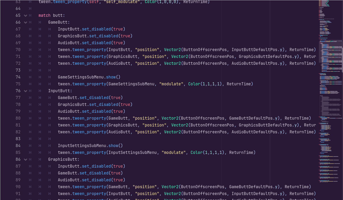
Options Sub-menus Implementation
The options sub-menus went through a few iterations. I liked all the ideas I came up with but I ultimately decided on the “boxy” approach seen in the sketches in order to stay true to the UI theming I set out for.
However, I will keep these options in my back pocket.
The Importance of Flow
I wanted to also keep in mind the “flow” of the player. A player clicking through these menus shouldn’t feel confused or slowed down by the menu. So the iterations requiring any form of scrolling was cut and the “wheel” idea was vetoed by me as it required rotating text which could be difficult for some users to read quickly.

The Problems Learning a New Engine
This was the point I really needed to deep dive into Godot’s workflow on how to create what I wanted.
After a lot of research and practicing in the engine, I learned how to apply motion using animators and tweens to achieve menus that were able to “flow” into each other seamlessly.
Feel free to talk to me about Godot how it was using it. Learning the engine was a great experience!

Accessibility Control Binding
For me and my teammate Damien Springer, implementing control binding for accessibility in one of our game projects was always something we’ve wanted to do.
Finally, we were able to add it to DNA! Menu designed by me and functionality made possible through their wonderful effort.

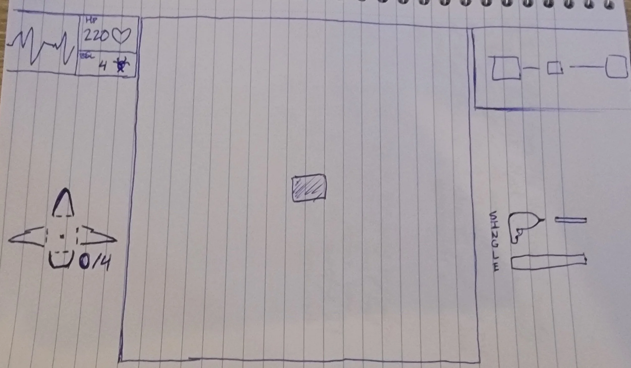


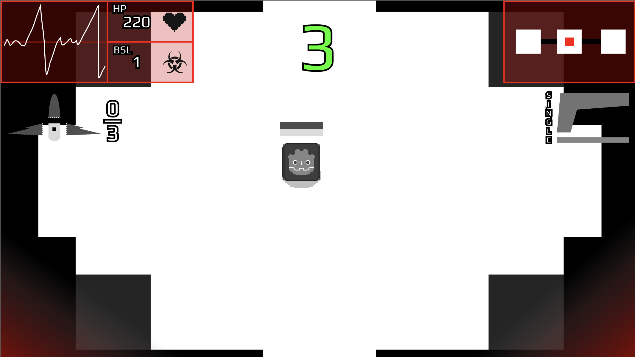

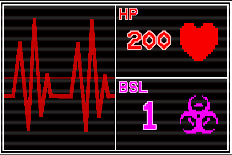
The HUD’s Iteration & Planning
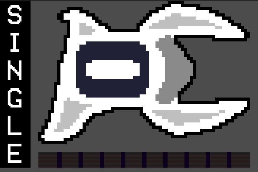
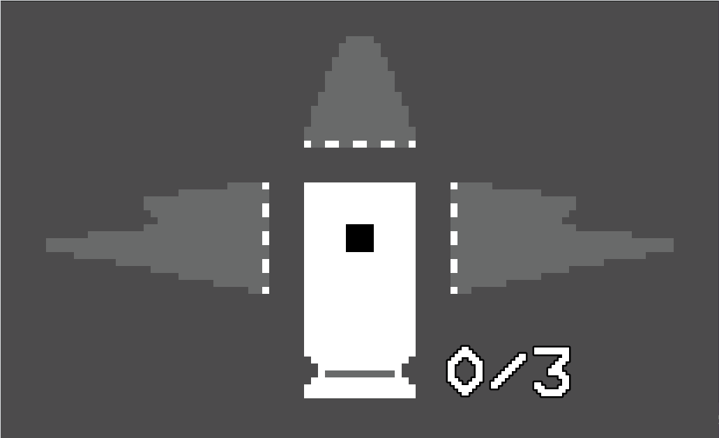
The HUD and its elements (HP, BSL, ship parts, gun) all received a lot of thought and planning in how the element will incorporate the theme of the game along with “quick-glancing” usability.
I aimed to use as little to no text as possible and use mainly visual language to convey information (see the ship part element).
Many HUD layouts were very appealing to me, but in the end, the more basic iteration 2 was what I went with as it had the most utilitarian “this corner is for specifically this thing” approach while not being too invasive or lop-sided in the visual weight of the HUD.
Using the Theme to Elevate the HUD
The game is based on the you (the player) being stuck on an alien planet while some creatures try to corrupt you.
To simulate the dire-ness of the situation, I researched into making the health and BSL (this game’s stat for corruption) level into an element that simulated an EKG graph like one you’d find at a hospital. I even hooked up some visuals to hammer this home!

Player Feedback
I was able to finish rough prototypes of the menus within a month of the start of development. Even then, many players said that the menus were fantastic in their motion and visual theming.
While the rest of the game still had a lot of work to be done, my work served as a great “north star” in pitching the game and the overall direction the rest of the team took in creating the visual language for our game.
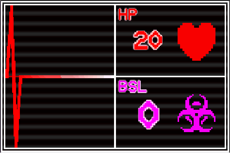
See image to the right for week 13 feedback.
Project Results
This project is still in development!
For now though, my work on the game has been very well-regarded as being successfully usable and visually appealing while also being very focused. There’s nothing too seemingly complicated about the designs but it has a lot of character and style that people enjoy.
Overall, results point to my work improving the game’s “vibe” and theming very well and elevated the experience of the game even outside of gameplay to feel really great and immersive.